Eating at a Jewish delicatessen engages all your senses. You taste the juicy pastrami bursting between two slices of rye, smell the sweet scent of schmaltz, hear the hot dogs sizzling on the grill, and feel like you’re eating with family — welcomed, yet your privacy is invaded by the tad-too-nosy waiter. But what exactly do you see? What, in the physical environment of a Jewish deli, makes a classic Jewish deli?
Old-school delicatessens vary in their design. Some are ornate, while others are more scrappy. This makes it difficult to define what exact features make a classic delicatessen — a question that has stumped everyone from architects to Supreme Court Justices.
In the Los Angeles Times article, “Just What Is A Delicatessen Supposed to Look Like, Anyway?” Pat Kuleto, the architect of Carnegie Deli’s Beverly Hills branch, suggests that there was no artistic vision behind delicatessen design, but that the furniture, colors and materials organically came to be based on what owners could scrounge up. Kuleto says that to design a classic deli you “put a few sandwich signs up on the wall, a few pictures of the owner, a couple of notices from the government… You’d turn the lights up real bright, hang a bunch of sausages around and show the food, you know, cause that was kind of the program — to just show off the food. And that was it — they called it a deli.”
In the 1910 The New York Times article, “Court is Mystified By Delicatessen,” Supreme Court Justice Whitney had to decide if a store with table seating was a delicatessen or a restaurant. He doubted there was even a proper definition of “delicatessen store,” suggesting that because the words had not yet become naturalized in the United States, “delicatessen” has what the law recognizes as a customary meaning. Justice Whitney noted that “even in New York City alone delicatessen may have different meanings in different parts of the city.” Ultimately, he decided that the store in question was a delicatessen despite its tables because delicatessens “could come in all types: all products, all types of character.”
The Nosher celebrates the traditions and recipes that have brought Jews together for centuries. Donate today to keep The Nosher's stories and recipes accessible to all.
The History of Delis in the United States
The first delicatessens in the United States opened in the late 1840s in New York City. They were German delicatessens and, in turn, the first Jewish delicatessens were German Jewish delicatessens. The next wave of Jewish immigrants in the United States came from Russia, Poland, Lithuania and Central Europe. There were distinct differences between the German Jews and the next wave of Eastern European Jews. Not only did they speak different languages, but they had different food cultures.
Children of Eastern European Jewish immigrants frequented delicatessens more than their parents, who thought the food was too foreign and overly spiced. For the children, it was a way of integrating into American culture while remaining part of the Jewish community.
A few of the old-school delicatessens still exist today, like Katz’s in New York, Langer’s in Los Angeles and Ben’s, which has locations across the United States, look exactly like they did a hundred years ago. While they look different, they do have similarities in design:
Neon Signs
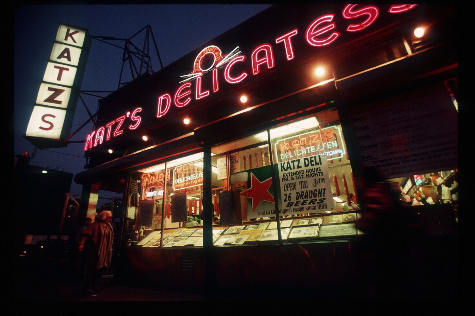
Before you even enter Katz’s deli, you can see the red neon sign halfway down Houston Street. Neon signs, a staple feature in a classic delicatessen’s facade, were an incredibly popular form of advertisement between the 1920s and 1960s. The technology was new and it allowed a company’s advertisements to be visible 24/7.
In “Pastrami on Rye: An Overstuffed History of the Jewish Deli,” author Ted Merwin explains “the immense neon sign connoted brashness and brazenness, opulence and ostentation; it joined in the nightly visual symphony of the lights of the skyscrapers of Manhattan.”
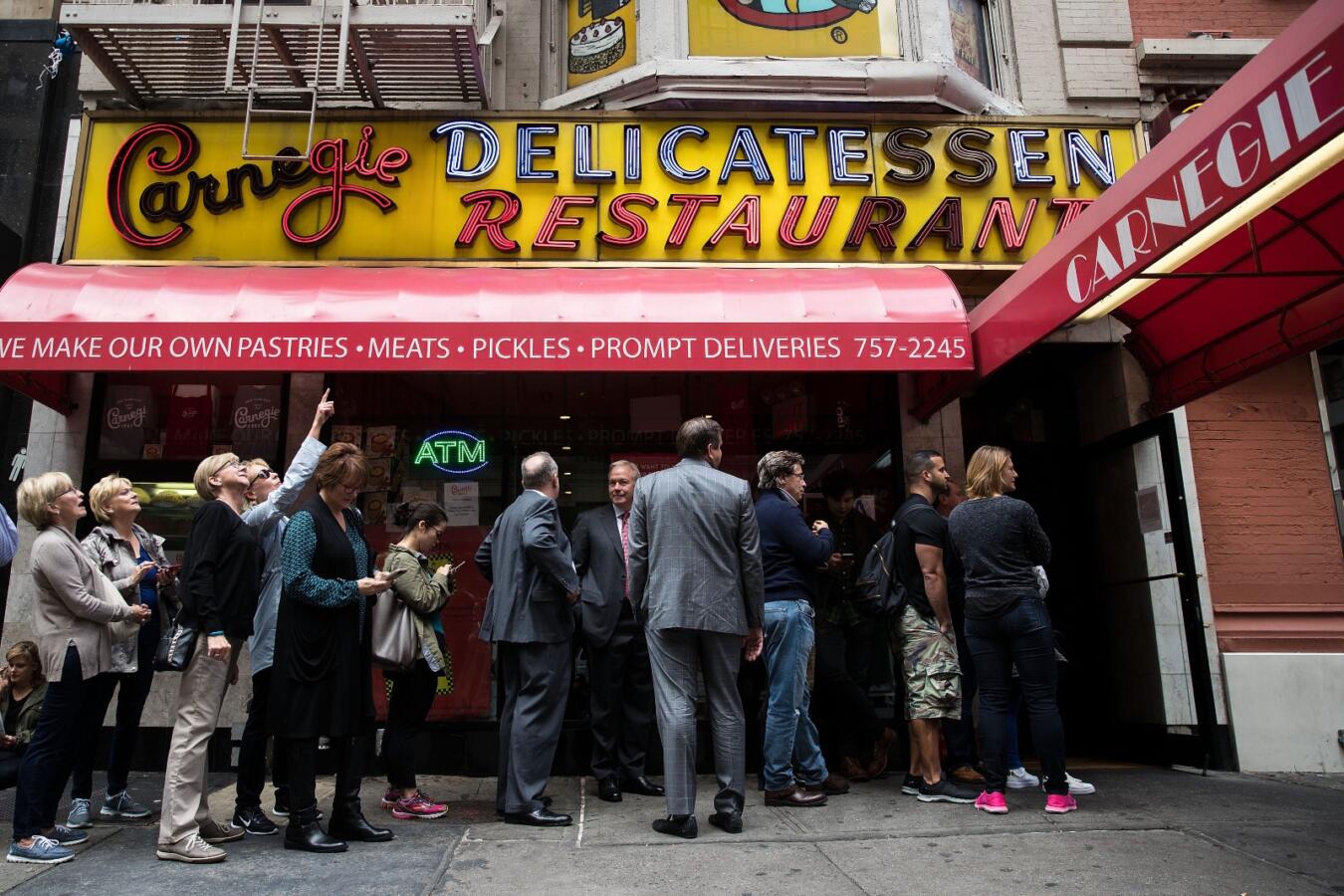
Katz’s and Ben’s, as well as the now closed Carnegie Deli Midtown Manhattan location, Lindy’s and Stage Delicatessen all had neon signs that boasted the store’s name. Often, they would also hang a smaller neon sign on the store’s plate-glass windows with the name of the company that supplied the meat, such as Hebrew National, Zion Kosher and 999.
The Counter
The counter of a Jewish deli runs down the front of the store but it’s the center of the action, allowing customers to get a glimpse of their options before opening the menu and converse with the deli man. The lit showcase displays a row of pastrami, brisket and other delicacies framed by beds of lettuce and a second row with bottomless trays of coleslaw, egg salad and chopped liver. An antique cash register sits on the counter, canned foods mask the walls behind, hard salami hangs above like garland, and tucked in the back is the deli man’s most important tool: the slicing machine. The counter is the most necessary piece in a deli’s construction.
Josh Lebewohl, an owner of New York’s iconic Second Avenue Deli, would agree. He says there is not “one specific color or material that you would find in a classic deli. However, the one thing any classic deli should have is a takeout counter.”
Manny’s Cafeteria & Deli in Chicago opened in 1942 without a counter, and operated without one until it’s recent $1 million renovation. The owners’ goal was to make improvements to ensure the deli’s longevity, while retaining its old-school charm. In the summer of 2016, after eight months of construction, Manny’s unveiled the renovations, its first changes since 1965. In addition to replacing the ceiling tiles, floors, and chairs, Manny’s expanded its square footage, taking over two neighboring businesses to build a carry-out counter where they sell to-go products.
Opulent vs. Simple
There are two kinds of classic Jewish delicatessens: the opulent Art Deco deli and the bare-bones deli.
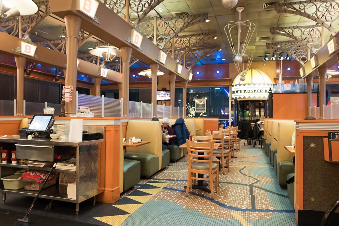
Ben’s Kosher Delicatessen is an example of the former, with its curved wood, burnished metal, frosted glass and mosaic tiles. Reuben’s, too, with its dark decor and gold accents, has been compared to the opulent lounge of the Radio City Musical Hall. As described in The New York Times article, “At a West 57th Street Corner, The Great Pastrami War”, the New York delicatessen, which opened in 1983 in Midtown Manhattan, was designed with the vision of “Hollywood Deco, romance, a bit of Radio City Music Hall and a bit of Bugsy berkeley.” There was beige marble, gilded statuary, curved balconies and Art Deco railings.
In “Pastrami on Rye,” Ronnie Dragoon, the owner of the Ben’s, details how he designed his delicatessens in a faux–Art Deco style with “bold colors and ceilings with Chagall-like designs that could be part of the stage for a production of Fiddler on the Roof” — an effect heightened by the Jewish folk music playing in the background.
Ben’s design has a playfulness — a trend seen at other delicatessens across the country. At the West 38th Street location, a whimsical, satirical oil painting hangs in the basement that depicts the restaurant as, “incorrectly, located on the same street as some of the most iconic, four-star restaurants in Manhattan… The painting suggests that Jews are ambivalent about forsaking the deli to eat in more gourmet restaurants, trading their traditional “peasant” food for upward mobility — if only they could have their pastrami and eat it too, the painting seems to say.” Upstairs, behind the deli counter, hangs a sign that reads “who said a nosh can’t be posh?”
Kenny & Ziggy’s in Houston, Texas, embraces similar humor in their design. Above their counter, is a sign that reads, “There are two types of people in this world, those who love Delis and those you shouldn’t associate with.”
While Katz’s is the most well-known Jewish delicatessen, besides the steep price of a sandwich, it’s far from fancy. Since opening in 1888, Katz’s has only undergone a few interior changes. The store expanded in 1948, the chairs were padded, and a sign was installed pointing to the table where the movie “When Harry Met Sally” was filmed. Everything else, like the formica tables and archaic ordering system have all stayed the same. It is, as the Time food columnist Josh Ozersky describes, the “old-time, antiquarian classic” that all New York delis have as their reference point.
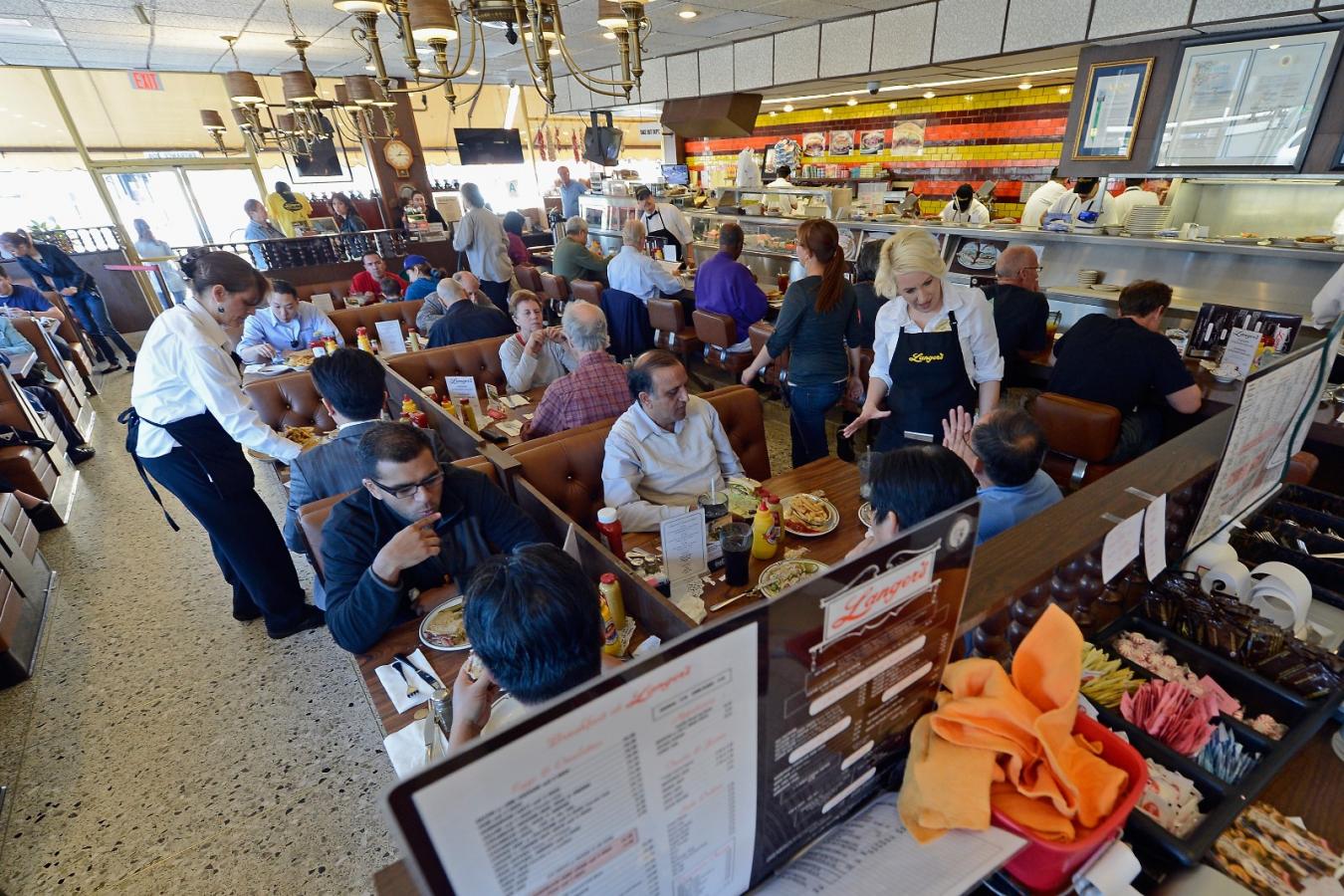
Langer’s in Los Angeles is also modest. It opened in 1947 with 12 seats and expanded, to 35 and then to 65 seats in its first 20 years. According to “Langer’s: A Classic American Culinary Story,” “the very look and feel you see today at Langer’s is the exact 1968 remodel as created by Al and Jean Langer — right down to the Naugahyde upholstery, turned-spindle brocade on the booths and period lighting fixtures.”
The New Jewish Deli
Today, there are new Jewish delicatessens opening across the U.S. Some have branded their stores as “authentic New York delis,” hanging New York memorabilia on their walls, like playbills, caricatures of stage stars and photographs of New York landmarks. Other “neo-retro delis’, as tokened by The New York Times, have a fresh style inspired by traditional design.
One example of a neo-retro deli is Gertie in Brooklyn, with its charmingly mismatched chairs, cocktails inspired by Dr. Brown’s soda fountain flavors, a bright interior, tropical houseplants, and modern pastel accent wall. The Infatuation playfully described it as a “California-themed diorama or a less-dark version of The Stepford Wives. It has high ceilings, big windows, and the soothing pastel color scheme of an upscale daycare center.”
In 2018, San Francisco-based restaurant consulting firm af&co. cited modern Jewish delis as a top trend for 2018, specifically noting Wexler’s Deli in Los Angeles. Wexler’s first location in the Grand Central Market food hall is cool and clean. Hip-hop music plays as customers order at a white tiled counter adorned with black graffiti drawings of fish, the Star of David, bagels and black and white cookies.
Wexler’s isn’t the only neo-retro deli in California. In Sacramento is Solomon’s, whose design and name was inspired by Russ Solomon of Tower Records, which once stood where the deli is now. Rather than a neon sign, a psychedelic mural painted on the ceiling greets diners as they enter the deli.
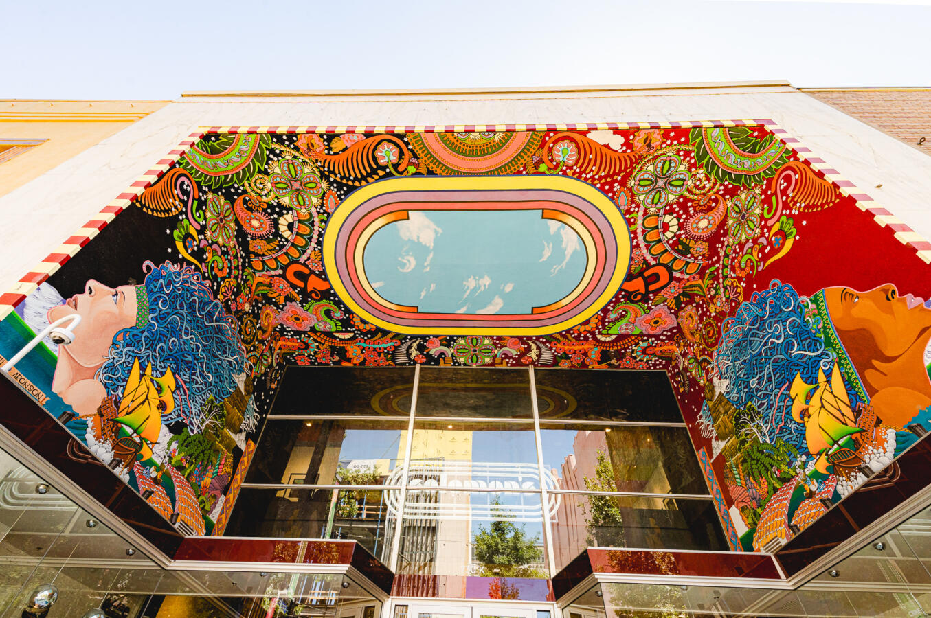
Inside, bold hues accentuate a mix vintage and contemporary design, including marble countertops, warm wood tables, and dark leather accents. Above the counter sits an art installation of vintage suitcases arranged like a game of Jenga.
Solomon’s, Wexler’s and Gertie are designed to entice a younger demographic prone to documenting their culinary experiences on Instagram; their design is starkly different from classic Jewish delicatessens, which are inadvertently designed to transport you back in time. Despite their differences in appearance, these delicatessens continue to bring people together to enjoy traditional Jewish delicacies.
